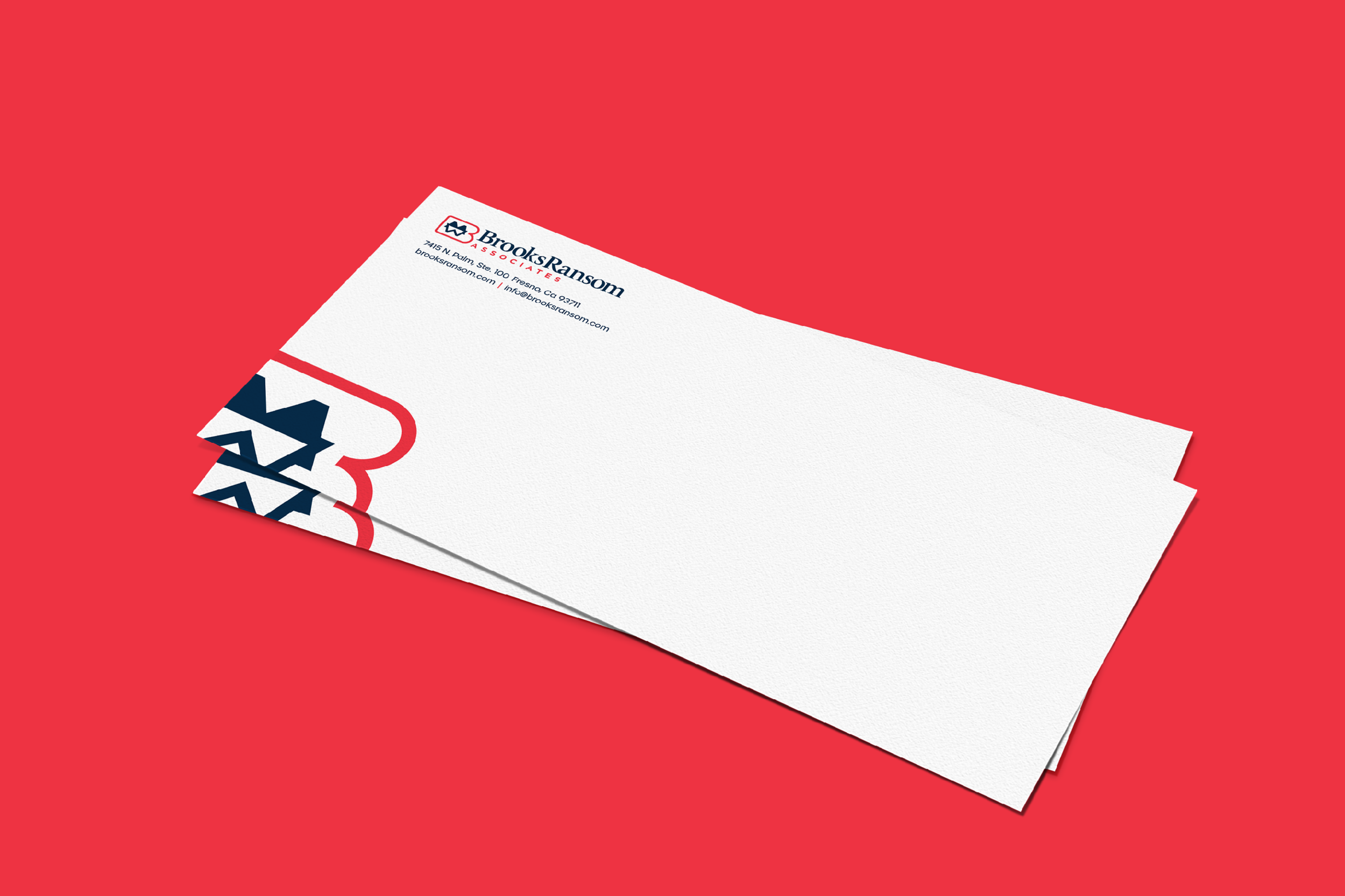
Updated brand identity for the largest structural engineering firm in the Fresno metropolitan area.

Brand Strategy: Sean Tambagahan | Photography by Chance James
Brooks Ransom Associates, with over 45 years of experience, is a trusted structural engineering firm known for innovative and reliable solutions. They excel in educational and commercial sectors, leveraging advanced technology and a commitment to quality. Their expertise ensures precise designs that meet future demands, making them a preferred partner for architects and developers aiming to create enduring structures.
-
Brooks Ransom Associates underwent a comprehensive rebrand to modernize their visual identity and strengthen their market presence. As part of this effort, my role was to refresh their logo, creating a sleek, modern design that aligned with the overall transformation. The rebrand also included a redesigned website with enhanced functionality and updated stationery that reflected their commitment to quality and innovation. This strategic update has reinforced Brooks Ransom Associates’ reputation as a trusted partner in the architectural and development sectors and positioned them for continued growth and success.
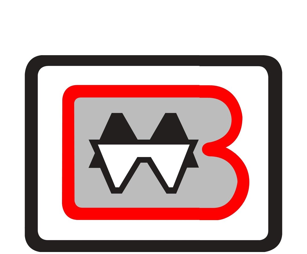
Before
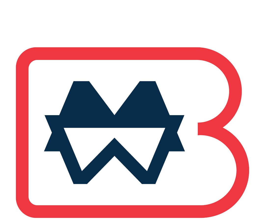
After